The Compass
Pin & Path, Modern & Layered
The Levant isn’t a headline. It’s a layered manuscript: layers of history, identity, grief, humour, trade, and survival written over each other.
Whyz doesn’t simplify those layers into binaries. It designs a navigation system for them: pins, paths, timelines, receipts. So complexity becomes readable.
This isn’t “hot takes.” It’s a map of reality you can follow. Layered, precise, and impossible to flatten.
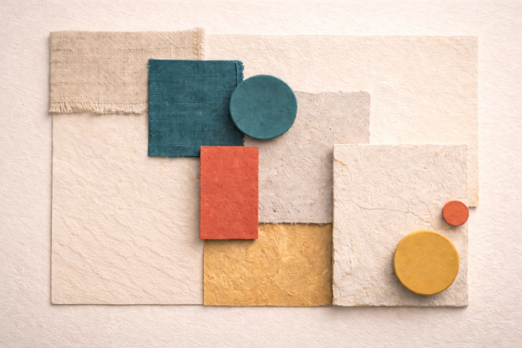
Color System
The Compass is about navigation through complexity. Teal and Deep Ink establish a clear system language for paths, structure, and wayfinding, while Paper prevents fatigue in longform and explainers. Cedar Light provides decisive emphasis when stakes are real, Coral acts like a location pin, Clay adds warmth and energy for highlights, Olive grounds the system, and Stone bridges the palette with a muted human tone.
Teal
digital clarity accent
#044251
Coral
signal accent
#AD2831
Deep Ink
primary base
#2E3135
Offwhite Paper
canvas
#EDE7D9
Cedar Light
accent / human spark
#CAC427
Saffron Earth
warm depth
#FB8B24
Fig Ink
secondary neutral
#7B4F61
Olive
grounding depth
#304421
Usage Rules
Deep Ink dominates (50–60%) as the system backbone for structure and seriousness. #2E3135
Offwhite Paper carries the reading experience (25–35%) to keep longform and explainers comfortable. #EDE7D9
Teal becomes the navigation colour (8–15%) for routes, wayfinding, and structure. #044251
Coral stays controlled (5–10%) as decisive emphasis for key points, not decoration. #AD2831
Secondaries are used like map symbols (combined under ~10–12%), each with a specific job.
Secondary roles
Cedar Light is the “pin” and key marker. Use sparingly. #CAC427
Saffron Earth is warmth and energy for highlights and calls to action in small doses. #FB8B24
Fig Ink is a soft bridge colour for cards, quoted modules, and category chips. #7B4F61
Olive is grounding depth for dividers, taxonomy chips, and low-emphasis panels. #304421
Functional UI mapping
Headlines / nav / primary text on light: Deep Ink #2E3135
Body text on dark: Offwhite Paper #EDE7D9
Links + interactive states: Teal #044251
Key markers / “you are here” / current selection: Cedar Light #CAC427
Primary CTA / key highlights: Saffron Earth #FB8B24 (small surfaces)
Warnings / sensitive context tags: Coral #AD2831 (subtle, never blocks)
Secondary surfaces / quote cards / chips: Fig Ink #7B4F61 (light touch)
Dividers / taxonomy chips / grounding panels: Olive #304421
Avoid
Using Coral as a background or large surface (it becomes aggressive fast)
Turning Cedar Light into a dominant brand colour (it should behave like a pin)
Mixing Cedar Light + Saffron Earth + Coral in the same screen without restraint (Compass must feel navigable, not loud)
Typography Direction
This direction needs typography that feels like navigation. Clear, structured, and capable of holding layered information without adding noise. The system should read like an index, a timeline, and a map all at once, while still feeling culturally rooted.
Principles
- One type family, one clear system.
- Structure is the style: weight, spacing, alignment.
- Made to guide the eye through complexity.
- Features are for better flow, not flair.
Typeface pairing
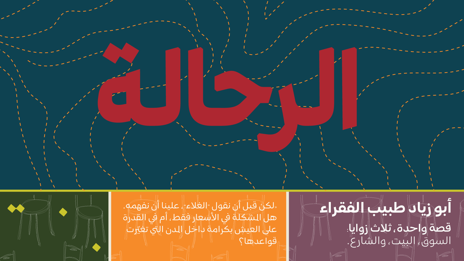
- Arabic headlines: Mestika Bold
- Arabic body and UI: Mestika Regular
Mestika is named after the resinous spice mastic, a mix of sharp edges and cursive connections. That duality is the point: it gives the typeface an edge that stands out while remaining readable. Built on Naskh foundations with a balance between Iranian and Arabic influences, Mestika stays culturally grounded but distinctly modern. Its wide set of ligatures and justification features make it especially strong for editorial layout, timelines, and structured explainers.
Typographic behaviours
- Headlines: concise, firm, low exclamation energy. Use weight, not noise.
- Subheads: carry context in one to two lines and help the reader orient quickly.
- Body: generous line height and comfortable measure for anti fatigue reading.
- UI labels and chips: consistent casing, spacing, and rhythm to reinforce “navigation” logic.
- Ligatures and justification features: used to improve flow and alignment, not as visual styling.
Weights and flexibility
- Mestika supports 9 weights plus a Pixels weight, and works in variable axes, allowing precise hierarchy from quiet metadata to strong headlines.
- Currently supports Arabic based languages, with Latin support planned in future releases.
Avoid
- Mixing multiple unrelated Arabic fonts in this direction. Compass needs one system voice.
- Condensed breaking news fonts, futuristic grotesks, or anything that reads like a tech dashboard.
- Overusing stylistic features for flair. In Compass, features serve readability and structure.
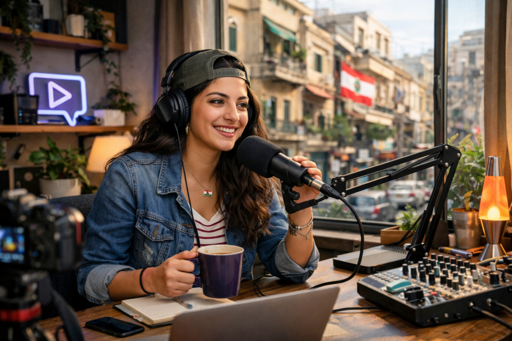
Photography & Visual Language
This is our intimacy advantage.
Photography style
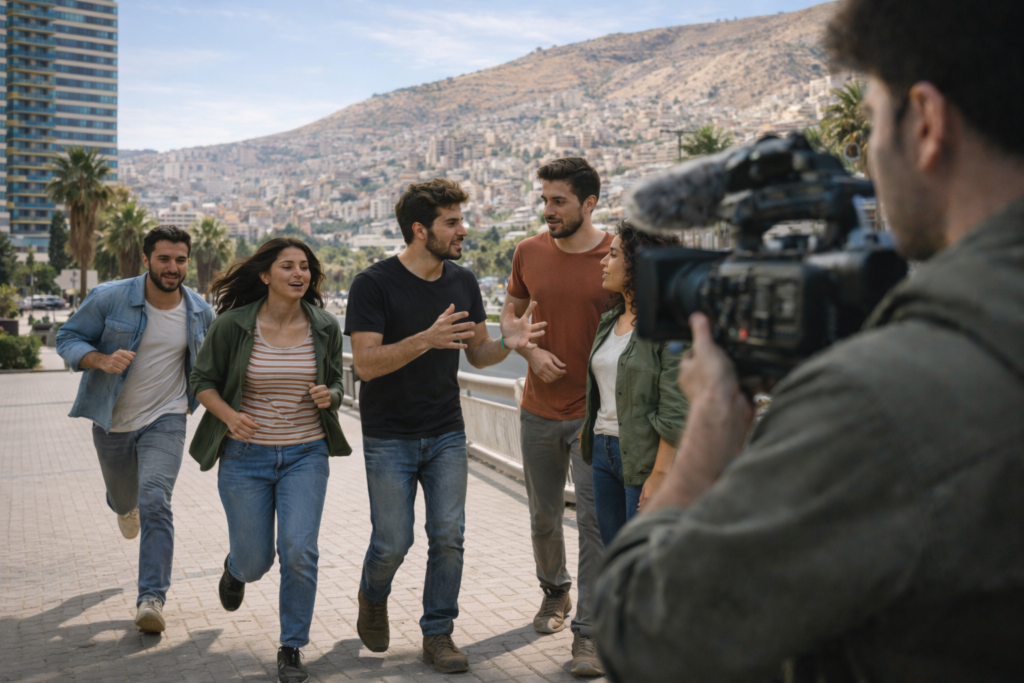
Documentary frames with environment and context
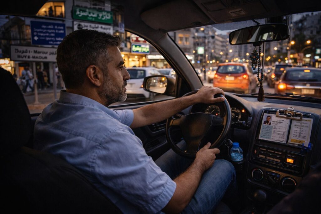
Evidence details: documents, signage, objects, hands
Image treatment rules
- Neutral-to-warm grading, controlled contrast
- Allow archival texture overlays, but keep them faint and disciplined
- Avoid turning overlays into noise
Graphic language
- Map fragments, route lines, grid overlays
- Timeline cards, glossary chips, index marks
- “Receipts” modules presented elegantly
- Rule: one overlay idea at a time, layered, not cluttered.
Studio / Set Design
The Evidence Room (warm edition)
Matte surfaces: wood, stone, paper textures, brushed metal
Artifacts: maps, books, documents, objects (real, curated)
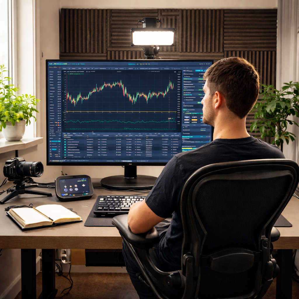
One evidence surface screen max; used for proof, not vibes
Spatial rules
- More structured blocking than Rituals (navigational clarity)
- Depth in background, minimal shine
- Lighting: controlled contrast, still warm enough to feel human
Avoid
- “tech lab” coldness, glass desks, LED-heavy walls, multi-screen command center.
Motion & On-Screen Graphics
Motion & On-Screen Graphics
- Timeline reveals (stepwise, calm)
- Map zooms (gentle, purposeful)
- Card stacking (context builds, doesn’t explode)
- Parallax used sparingly to show depth of history
On-screen rules
- A single consistent “pin + path” line style
- Chips and labels behave like a navigation system, not decoration
Avoid
- infographic storms, fast stings, aggressive swooshes, constant motion.
Content Packaging
- Frame-led explainers: context → layers → implications
- Timeline journalism (what happened, when, what changed)
- “Underreported angle” series (minorities, identity, diaspora)
- Investigations with receipts presented cleanly
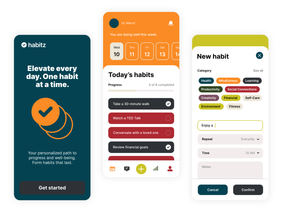
UI components to standardise
- Timeline module
- Glossary drawer
- “What we know / What we don’t” box
- Receipts module (sources + links + credibility cues)
- Pin + path navigation motif
DO
- Make complexity navigable
- Keep overlays disciplined and consistent
- Feel modern but grounded
DON’T
- Turn into techno-futurism
- Over-layer until it becomes noise
- Drift into dashboard aesthetics