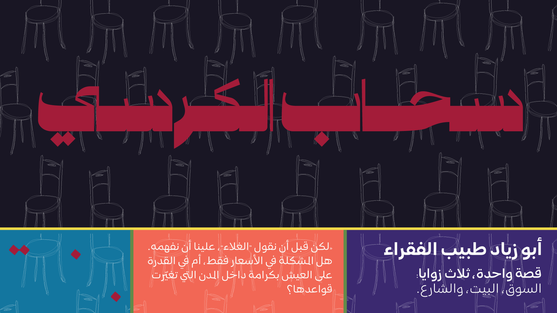
The Rituals
Human & City-Intimate
In the Levant, the most serious conversations happen at ordinary tables. Coffee isn’t a drink, it’s a social contract: sit, listen, disagree, laugh, and come back tomorrow.
Whyz borrows that ritual and turns it into a format: equal-seat, street-level, human. Where the city participates in the story.
This isn’t “talking heads.” It’s civic conversation you can enter. Warm, grounded, and impossible to fake.
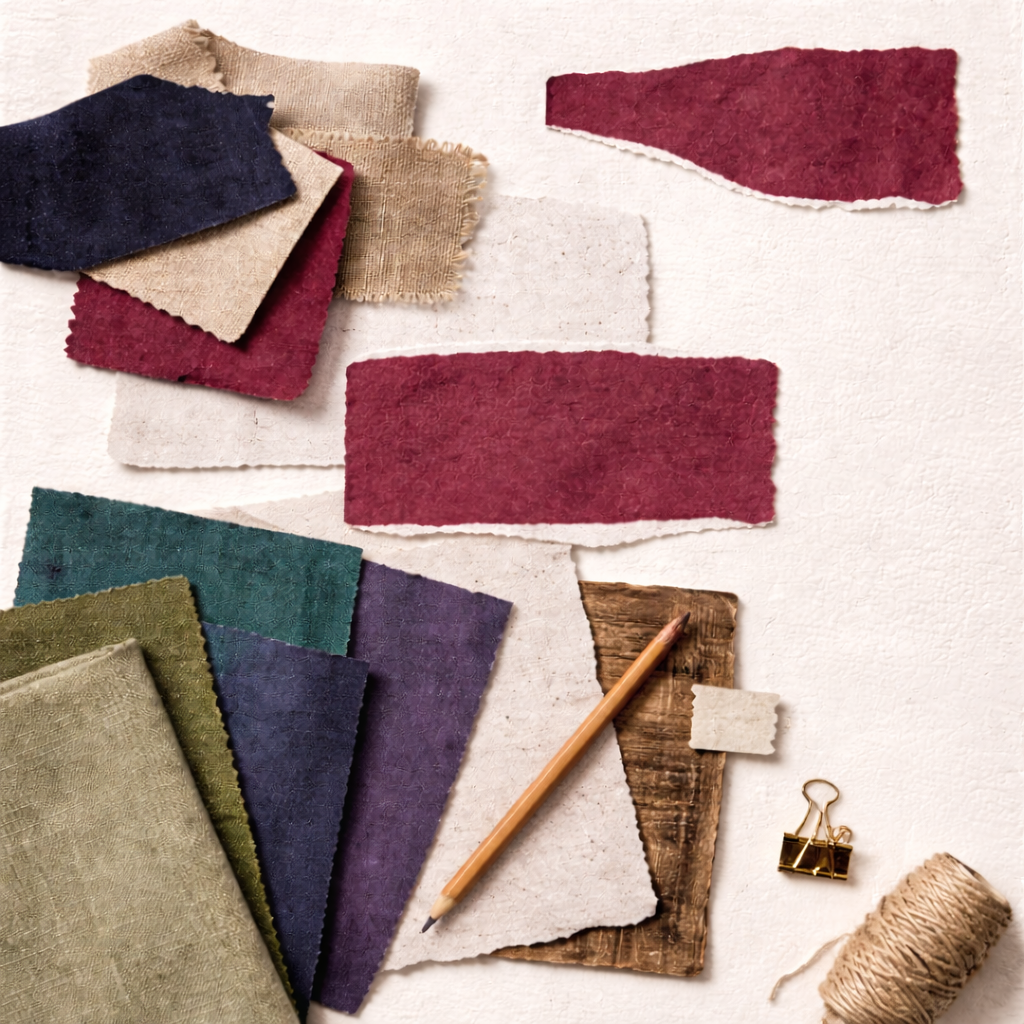
Color System
Rituals are built on depth, memory, and atmosphere. Deep Ink and Burgundy carry seriousness and intimacy, Paper and Stone keep it breathable, and Violet introduces a ceremonial signature without feeling elitist. Teal provides modern function, Olive adds grounded texture, and Coral brings human pulse in small, deliberate moments.
Deep Ink
primary base
#1B1725
Burgundy
rich depth accent
#A30036
Stone
secondary neutral
#DDC4A2
Offwhite Paper
canvas
#F5F2EB
Olive
grounding depth
#628B48
Teal
digital clarity accent
#06759D
Violet
ritual signature accent
#3A1772
Coral
signal accent
#FE6752
Usage Rules
Deep Ink dominates (55–65%). It’s the authority and calm anchor.
Offwhite Paper + Stone carry the reading experience (25–35%). Keep it breathable and non-fatiguing.
Burgundy stays controlled (5–10%). Use it as “ritual depth,” not as a loud brand wash.
Secondary colours are deliberate (combined under ~10–15%) and used for function, not decoration.
Violet is a signature accent, not a base. Use it sparingly to avoid drifting into “aesthetic brand.”
Secondary roles
Teal is your clean digital utility colour (links, focus, active states).
Coral is punctuation (highlights, key markers, callouts).
Olive is grounding and “material” (chips, dividers, subtle panels).
Violet is the ritual signature (section framing, special series identity, hero accents in small doses).
Functional UI mapping
Headlines / nav / primary text on light: Deep Ink #1B1725
Body text on dark: Offwhite Paper #F5F2EB (never pure white)
Links + interactive states: Teal #06759D
Primary CTAs / key markers: Coral #FE6752 (use like punctuation, not background blocks)
Sensitive context tags / warnings: Burgundy #A30036 (subtle, small surfaces only)
Section dividers / category chips / low-emphasis panels: Stone #DDC4A2 with Olive #628B48 accents
Special series / “Ritual” moments / hero framing: Violet #3A1772 (controlled, not dominant)
Avoid
Using Burgundy + Violet together at large scale (tilts fashion/editorial fast)
Coral backgrounds (it gets loud immediately)
Pure black or cold white (you already have better anchors)
Typography Direction
This direction needs type that feels like ritual and memory, but still reads clean and modern. The system must carry gravitas without becoming heavy, and it must stay highly legible across longform, UI, and social formats.
Principles
- Moody and memorable, but always readable.
- Strong display headlines, clean body type for endurance.
- Use stylistic extras rarely and on purpose.
- Hierarchy feels steady, not dramatic.
Typeface pairing
Arabic headlines: Rubbama Typeface
A black, vintage style Arabic display face with precision and an expressive flow. Use it for hero titles, section openers, and statement lines. Choose between Normal and Expanded to control drama and width without resorting to effects.
Arabic body and UI: KO Sans Typeface
A geometric humanist Arabic sans built for clarity and interface friendliness. With 7 weights from Thin to Bold and a wide range of stylistic sets, it supports long reads, navigation, captions, and digital product patterns while still feeling designed.
Typographic behaviours
- Headlines: short, declarative, low exclamation energy. Let weight and form do the work.
- Subheads: carry context in one to two lines and guide the reader calmly.
- Body: generous line height, comfortable measure, and clear paragraph breaks to reduce fatigue.
- Stylistic sets and ligatures: applied deliberately, not globally. One clear decision per layout.
- Expanded headline style: reserved for major moments only, not every header.
Avoid
- Condensed breaking news fonts, hyper modern tech grotesks, and anything that reads like a trading platform.
- Overusing display typography in body contexts. Rubbama is for impact, not endurance.
- Excessive stylistic alternates that turn the system into decoration or reduce consistency.
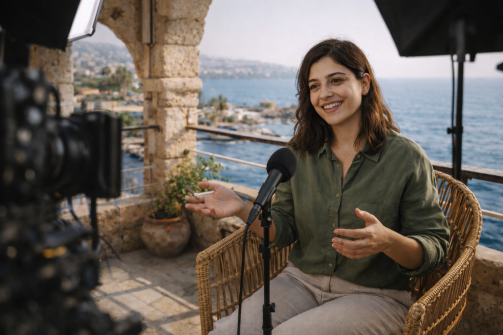
Photography & Visual Language
This is our intimacy advantage.
Photography style
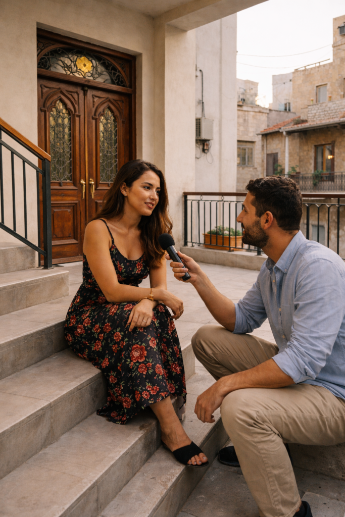
Eye-level, close, equal-seat framing
More listening than lecturing
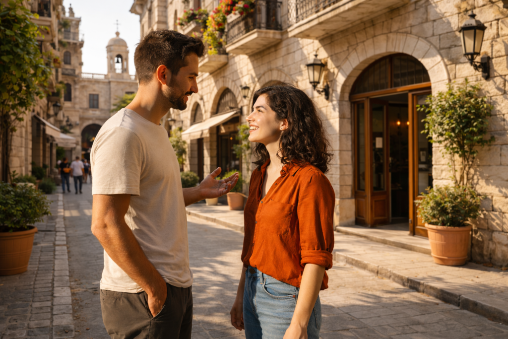
City context as texture: rooftops, balconies, stairwells, cafés, doorways
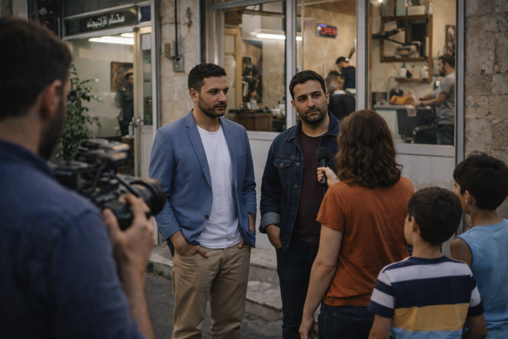
People shown as whole humans, not “case studies”
Image treatment rules
- Warm midtones, soft contrast, preserved shadows
- Natural skin tones (slightly warm), no heavy HDR
- Avoid sensational crisis framing; choose dignity-first composition
- Minimal overlays; if any, keep them conversational (speaker chip, quote card)
Graphic language
- Conversation devices: speaker chips, quote cards, “Key takeaway” note cards
- Architectural shadows as separators (rail shadows, window frames)
- Subtle paper texture can carry consistency without feeling editorial-heavy
Studio / Set Design
living room overlooking the city
Balcony-style seating or café-table logic

Warm practical lamps + soft key
Textured backdrops: plaster, wood, linen, ceramics, plants
Spatial rules
- No anchor desk
- No face-off staging; angles should invite, not challenge
- Camera sits closer than typical TV distance
- Background depth feels real and lived-in (not LED wall wallpaper)
Avoid
- LED strips, glossy floors, “studio as a command center.”
Motion & On-Screen Graphics
Motion & On-Screen Graphics
- Near-invisible transitions: soft fades, gentle slides
- Lower thirds: calm, minimal, never fighting the face
- Use Clay/Olive subtly for emphasis, not Quince (Quince is Lantern’s signature)
Avoid
- tickers, fast wipes, kinetic typography, constant micro-motion.
Content Packaging
- Interviews that feel like “pull up a chair”
- “One question, three perspectives” (plurality without shouting)
- Street-level explainers anchored in people and lived reality
- Mini-doc vignettes with intimacy, not spectacle
UI components to standardise
- “Voices” module (3–5 quotes, clean attributions)
- “What we heard” summary box
- “So what?” implications box (firm, not preachy)
- Speaker chips that feel human (simple: name, role, place)
DO
- Feel lived-in, warm, equal-seat
- Keep the conversation structured and credible
- Let quiet moments exist
DON’T
- Become casual to the point of losing authority
- Turn Levant identity into decorative clichés
- Copy podcast influencer aesthetics