THE LANTERN
Quince & Ink, Warm & Intellectual
Quince is a stubborn fruit; bitter, fragrant, imperfect. You don’t bite it raw; you transform it with patience into something people remember. That’s the Whyz approach to truth: take harsh reality, cook it into clarity, and serve it warm and credible.
It isn’t “breaking news.” It’s journalism you can touch. Quiet, serious, and impossible to ignore.
Color System
This Direction is about turning intensity into clarity. Deep Ink and Paper create trust and reading comfort, while Quince behaves like a highlighter that pulls out what matters. Olive and Clay ground the world in Levant materials and warmth, and Coral plus Teal add controlled signal and modern navigation without slipping into sterile newsroom aesthetics.
Quince
accent / human spark
#F3D948
Deep Ink
primary base
#F3D948
Stone
secondary neutral
#C6B49C
Offwhite Paper
canvas
#FBFCF8
Coral
signal accent
#A52422
Olive
grounding depth
#3C3E20
Teal
digital clarity accent
#1985A1
Clay
warm depth
#744437
Usage Rules
Deep Ink dominates (60–70%). It’s the credibility anchor and the “quiet authority” base.
Offwhite Paper + Stone carry the reading experience (20–30%) to reduce fatigue and keep it human.
Quince stays punctuation (5–10%). Use it like a highlighter, not a background colour.
Secondary colours are restrained (combined under ~10–15%) and should always have a job, not a mood.
Secondary roles
Teal is functional clarity (links, active states, informational modules when you don’t want yellow).
Coral is sensitive emphasis (alerts, high-stakes tags, critical notes in small doses).
Olive is grounding depth (dividers, chips, subtle panels, studio texture notes).
Clay is warmth in the shadows (borders, hover states, quiet accents, material cues).
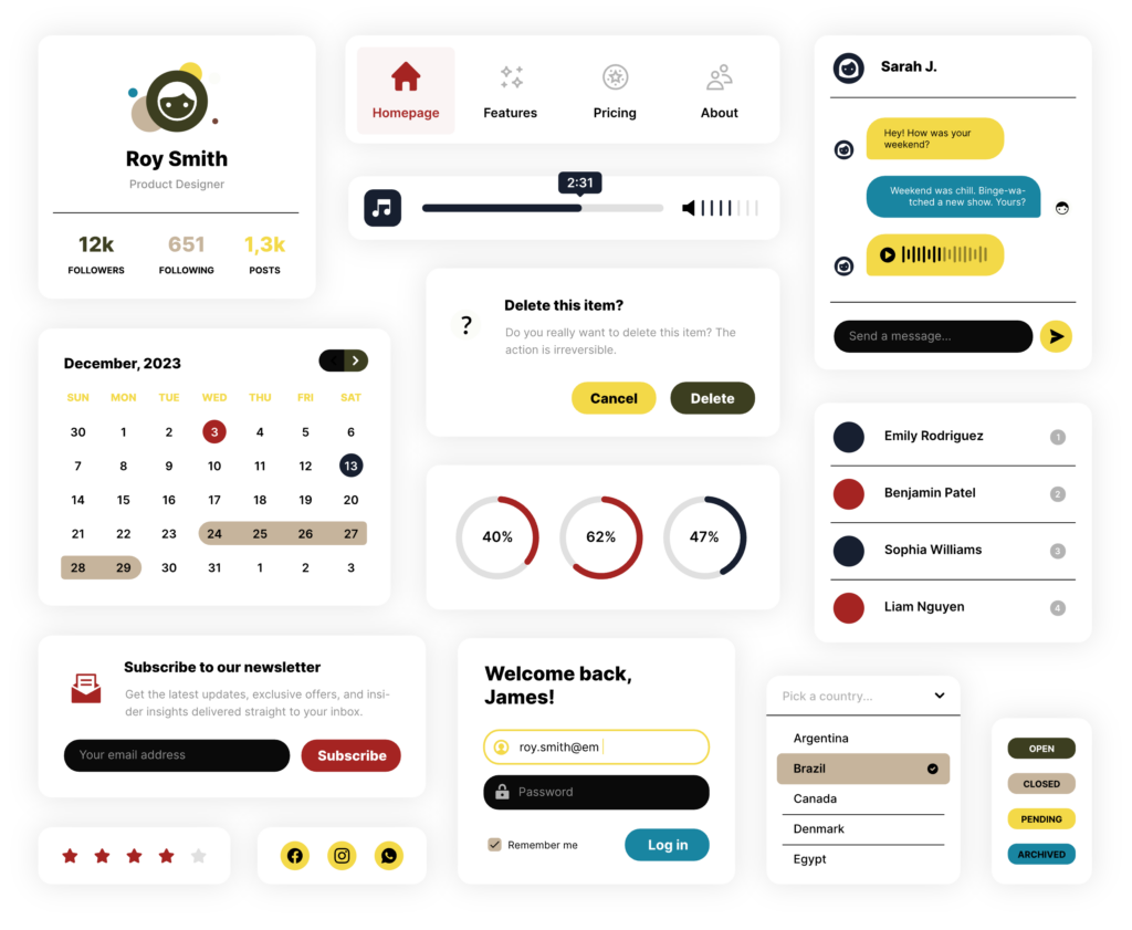
Functional UI mapping
Headlines / nav / primary text on light: Deep Ink #171F30
Body text on dark: Offwhite Paper #FBFCF8 (never pure white)
Links + key indicators: Quince #F3D948 (or Teal #1985A1 if you want less “highlighter”)
Backgrounds: Offwhite Paper #FBFCF8 with Stone #C6B49C for secondary surfaces
Warnings / sensitive context tags: Coral #A52422 (subtle, small surfaces only)
Dividers / chips / low-emphasis panels: Olive #3C3E20 and Stone #C6B49C
Warm accents / borders / hover states: Clay #744437 (quiet warmth, not dominant)
Avoid
Turning Quince into large backgrounds (it gets loud fast)
Pure black (use Deep Ink instead)
Cold whites (use Offwhite Paper)
Using Coral as a dominant brand colour (keep it informational, not decorative)
Typography Direction
This direction needs type that does two jobs at once: carry cultural authority and stay easy on the eyes. It should feel like a late night editorial with receipts, not a loud broadcast, and not a sterile interface.
Principles
- Feels like an editorial journal, not a TV channel.
- Warm and crafted, but never decorative.
- Built for long reading. Comfort wins.
- Headlines stay calm and confident, not urgent.
Typeface pairing
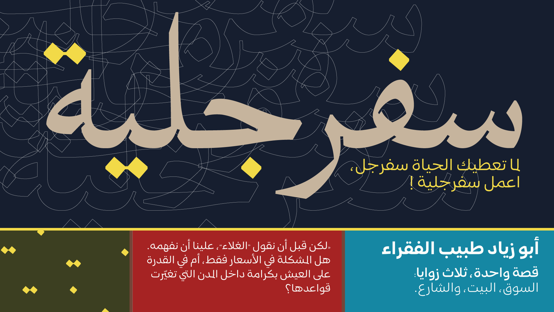
- Arabic headlines: Guesswhat Typeface
Contemporary editorial Arabic with expressive control through OpenType features, including kashida. Best for hero statements, section titles, and short headline lines that need presence without shouting. - Arabic body and UI: Zanjabeel Typeface, A hybrid between Naskh and modern Kufi with multiple weights for hierarchy. Built for comfortable long reads, captions, and interface text across print and digital.
Typographic behaviours
- Headlines: short, confident, low exclamation energy. Let the type breathe.
- Subheads: do the heavy lifting in one or two lines. Clarify the frame and lower cognitive load.
- Body: generous line height and comfortable measure. Prioritise calm reading over density.
- Kashida and alternates: used deliberately, one decision at a time. Rhythm, not decoration.
Avoid
- Condensed breaking news typography, urgent visual language, and anything that feels like a trading platform interface.
- Over styling headlines with too many alternates or constant kashida use.
- Tight line spacing, long unbroken paragraphs, and aggressive contrast that increases fatigue.
Photography & Visual Language
This is where trust is built; through restraint and proximity
Photography style

Human-scale, close distance (50–85mm feeling)
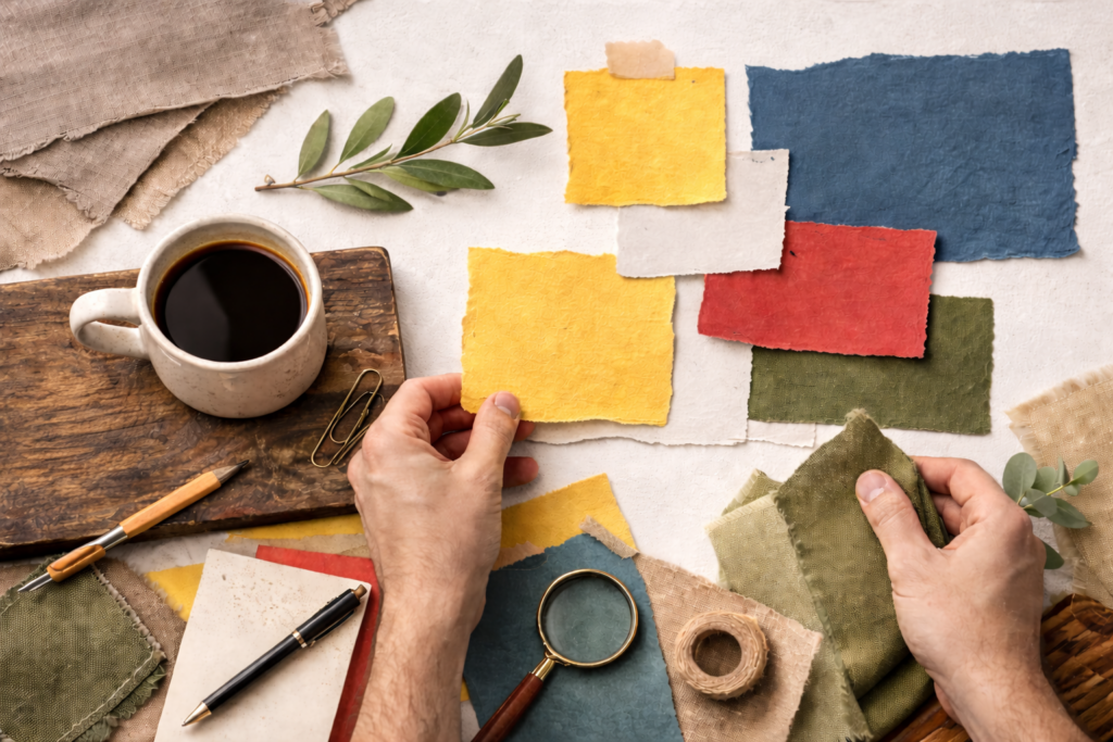
Texture is a feature: grain, paper, fabric, stone, wood

Subjects: thinkers, witnesses, communities, not posed figures

Available light look with controlled warmth
Image treatment rules
- Mild contrast, preserved shadows (calm)
- Skin tones natural, slightly warm
- Avoid sensational framing; prioritise dignity and agency.
- Archival overlays allowed but light-touch: stamps, map fragments, handwritten marks (sparingly)
Graphic language
- Use editorial devices: rules/lines, marginal notes, footnote markers, “source” chips
- Think magazine layout meets digital product, not TV lower-thirds spam.
Studio / Set Design
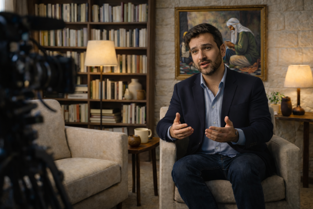
Living room editorial salon

Warm key light, soft shadows
Textured backdrops: plaster, linen, wood, aged metal, stone

Objects: real books, maps, ceramics
Spatial rules
- Seating: conversational angles, not confrontational face-off
- Camera: closer than “TV distance” (intimacy)
- Background: layered depth, not LED wall graphics
- Sound: visible acoustic warmth (panels disguised as textiles/wood)
Avoid
- glossy white desks, blue-red LED strips, “command center” vibes.
Motion & On-Screen Graphics
Motion & On-Screen Graphics
- Slow-in, slow-out; minimal bounce
- Transitions: wipes, fades, gentle parallax
- Lower thirds: single line + optional source chip
- Use Quince as cursor/highlighter energy, not strobe accent
Avoid
- breaking-news animations, fast tickers, aggressive swooshes, constant movement.
Content Packaging
- “Explained” pieces with source-led structure
- Interviews that feel like a civil conversation
- Mini-docs with archival texture + modern clarity
- Opinion that reads like a letter with evidence, not a rant
UI components to standardise
- Context chip (e.g., “Background”, “Voices”, “Timeline”, “Glossary”)
- Receipts module (sources + links, elegantly formatted)
- Key lines pull-quotes in Quince highlight
- Timeline using Stone/Ink with Quince markers
DO
- Feel warm, intimate, editorial
- Prioritise reading comfort
- Use texture as identity
- Let sources and structure be the authority
DON’T
- Shout visually
- Use sterile “newsroom template” layouts
- Overuse Quince
- Look like a finance app, activism poster, or TV channel