Whyz Media | Brand Book 2026 | Internal & Partner Use

The logo

Reversed Logo

Main Logo with Question Line

Logo Anatomy

Scaling Rule

Minimum Size

Not Whyz to use

Clear Space

The Monogram

Main Monogram

Main Monogram with Question Line

Monogram Breaking out

Monogram in Photo

Not Whyz to use

The Question Mark

WHYZ Quince Question

WHYZ Ink Question

The Question Line

The Complete Question Line

Colors

Lantern is built on Deep Ink + Paper as the trust and reading system, with Quince acting as the signal marker. To introduce more vibrancy for a younger, mobile-first audience, we’re curating secondary accents that perform in real platform conditions: small UI elements, subtitles, tags, and motion-safe highlights. This adds energy where it counts, while keeping the overall tone serious, calm, and credible.

Primary Colors

Deep Ink

primary base

#1a2131

Primary Colors

Quince

accent / human spark

#f3d948

Neutral Colors

Parchment

secondary neutral

#F8F3EC

Neutral Colors

Porcelain

canvas

#FBFCF8

Secondary Colors

Magenta Bloom

ATTENTION MARKER

#EC1763

Secondary Colors

Persian Blue

CREDIBILITY DEPTH

#0038BC

Secondary Colors

Slate Blue

INTERACTION CUE

#7678ED

Secondary Colors

Teal

digital clarity accent

#028090

Secondary Colors

Emerald

Positive signal

#32de8a

Secondary Colors

Golden Orange

HUMAN WARMTH

#EFA119

Color USage

Usage Rules

Deep Ink dominates (60–70%). It’s the credibility anchor and the quiet authority base across all directions.

Porcelain and Parchment carry the reading experience (20–30%). Use them to reduce fatigue and maintain warmth. Porcelain is the primary canvas; Parchment is the secondary surface, slightly warmer and more textured in feel.

Quince stays punctuation (5–10%). It behaves like a highlighter — a marker, not a background. When it appears, it should signal something: a key line, an active state, a moment worth noticing.

Secondary colors are deployed with intent (combined under 10–15%). Each one has a specific job. None of them should appear for decoration.

Secondary roles

Teal is functional clarity — links, active states, and informational modules when you want something more neutral than Quince.

Persian Blue is credibility depth — use it for serious editorial framing, data anchors, and contexts where authority needs to feel grounded rather than energetic.

Slate Blue is interaction — hover states, selected states, interactive chips, and secondary UI elements that need to feel responsive without competing with Quince.

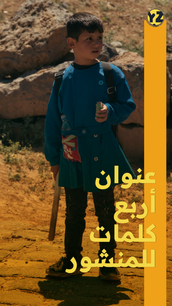
Golden Orange is human warmth — callouts, highlight accents, and moments of energy that need to feel optimistic rather than urgent.

Emerald is positive signal — progress indicators, resolved states, affirmative tags, and anything that needs to communicate forward motion.

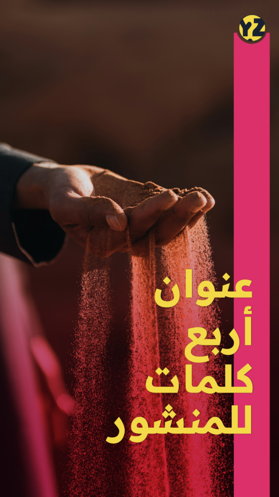
Magenta Bloom is attention — use it sparingly and only when something genuinely demands notice. It has high interrupt value; that value disappears fast if overused.

Functional UI mapping

Headlines / nav / primary text on light: Deep Ink #171F30

Body text on dark: Porcelain #FBFCF8 (never pure white)

Links + key indicators: Quince #F3D948, or Teal #028090 for a less high-contrast option

Primary canvas: Porcelain #FBFCF8 with Parchment #F8F3EC for secondary surfaces and card backgrounds

Interactive states / selected UI: Slate Blue #7678ED (secondary), Teal #028090 (primary functional)

Credibility anchors / serious editorial modules: Persian Blue #0038BC (used like structure, not color)

Energy highlights / warmth accents: Golden Orange #EFA119 (small surfaces, never dominant)

Positive / resolved tags: Emerald #32DE8A (functional, not decorative)

Attention / critical interrupts: Magenta Bloom #EC1763 (maximum restraint — one moment per screen)

Avoid

Turning Quince into large backgrounds. It reads as loud immediately.

Using Magenta Bloom more than once per view. It burns through its interrupt value fast.

Running Persian Blue and Slate Blue together at scale — they create visual competition without hierarchy.

Pure black (Deep Ink is the correct dark) and cold white (use Porcelain or Parchment).

Treating Emerald or Golden Orange as brand colors. They are functional signals, not identity colors.

Deploying more than two secondary colors in a single layout without a clear structural reason.


Typography Direction

Lantern typography here is designed for screen-first consumption and a younger, mobile-led audience. The priority is effortless readability and clean hierarchy so subtitles, tags, and UI elements stay clear across formats.

By keeping the type light and minimalist, we create more room for visual cues like highlights, markers, and source chips to do their job without clutter.

WHYZ Typeface: Readex Pro

Role: Signature headline accent (fusion element), high personality.

Strong display character for hero moments and identity “edge”

Works well as a controlled headline layer without turning into calligraphy-first branding

Can deliver a memorable voice quickly

Can be used for: Hero titles, key series branding, poster moments, episodic headers, body

Typography Rules

Principles

One type family, one clear system. Structure is the style: weight, spacing, alignment. Made to guide the eye through complexity. Features are for better flow, not flair.

Arabic headlines: Readex Pro Bold Arabic body and UI: Readex Pro Light

Readex Pro is a bilingual typeface built for screens. It balances digital clarity with visual warmth, supporting Arabic and Latin in a single integrated design. Its range of weights carries the full typographic hierarchy — from hero headlines to fine metadata — in one consistent voice.

Headlines: concise, firm, low exclamation energy. Use weight, not noise. Subheads: carry context in one to two lines and help the reader orient quickly.

Body: generous line height and comfortable measure for anti-fatigue reading. UI labels and chips: consistent casing, spacing, and rhythm to reinforce navigation logic.

Readex Pro supports 6 weights working on variable axes, allowing precise hierarchy from quiet metadata to strong headlines. Arabic and Latin are designed together as one integrated system.

Mixing unrelated Arabic fonts. This system needs one voice. Condensed breaking-news fonts, futuristic grotesks, or anything that reads like a tech dashboard. Heavy weights in body text. Light is reserved for long-form reading comfort.

مقياس النسبة الذهبية — φ
Golden Ratio Type Scale
النسبة الذهبية (φ = 1.618) هي نسبة رياضية تظهر في الطبيعة والفن والعمارة. عند تطبيقها على الطباعة، تُنتج تسلسلاً هرمياً متناسقاً بصرياً. كل حجم خط هو نتاج ضرب الحجم الأصغر في φ.

The golden ratio (φ = 1.618) produces a type scale where each step feels naturally proportional to the next. Start from a base of 16px — each heading level multiplies by φ, giving a scale that feels balanced without arbitrary guesswork.
Base16pxBody / H6
× φ16 × 1.618 = 26pxH5
× φ²16 × 2.618 = 42pxH4
× φ³16 × 4.236 = 68pxH3
× φ⁴16 × 6.854 = 110pxH2
× φ⁵16 × 11.09 = 177pxH1
How to apply the φ scale
01
Start with H1. Place a single line of H1 text on your artboard. Resize until it fills no more than 70% of the artboard width. That size is your H1 — even if you never use it.
02
Derive everything from H1. Divide your H1 by φ (1.618) to get H2. Divide H2 by φ to get H3, and so on. Every level is proportionally related — not guessed.
03
Set body to H6 or H6 ÷ φ. Keep body weight Light and headings Bold — the weight contrast does as much work as the size contrast.
04
Use the scale, not every step. Pick the levels that serve your layout. Unused sizes still matter — they anchored the proportions of the ones you kept.
Headings — Bold · φ Scale · base 16px
H1 · 177pxعنوان إفتراضي
H2 · 110pxعنوان إفتراضي
H3 · 68pxعنوان إفتراضي
H4 · 42pxعنوان إفتراضي
H5 · 26pxعنوان إفتراضي
H6 · 16pxعنوان إفتراضي
Body Text — Light · 16px
وايز وُلد لجمهور يعيش حالة إشباع زائد ويعاني من الإرهاق. أشخاص يبقون على تواصل مع الشأن العام لكنهم يجدون في الإعلام العدواني استنزافاً لا إضاءة. نهجنا حازم ومركّز دون أن يكون مواجهاً. نقدّم العمق بدل العناوين السطحية. جادون وفي المتناول في آنٍ واحد.

Motion & On-Screen Graphics

Motion & On-Screen Graphics
Avoid
Content Packaging
UI components to standardise
DO
DON’T

Sound Logo

A sound logo is a short audio signature that represents a brand through sound the way a visual logo represents it through form. It is compressed, intentional, and instantly recognizable.

For Whyz, a sound logo is a functional identity element, the audible expression of the same values that govern every visual decision: clarity over noise, depth over stimulation, human over broadcast.

Why it matters:

We process sound faster than visuals. Auditory recognition triggers memory and emotion before conscious thought kicks in.

Attention is fragmenting. Audiences listen across screens, speakers, and spaces where the visual brand is absent. A sound logo keeps the brand present when it cannot be seen.

It carries emotional tone. Warm or authoritative, playful or precise — a sound logo communicates brand character in a fraction of a second, without a word.

It deepens the identity system. When aligned with the visual brand, it reinforces recognition. When missing, something feels incomplete.


Social Media Playbook

Reel Covers
Reel Inserts
Static posts